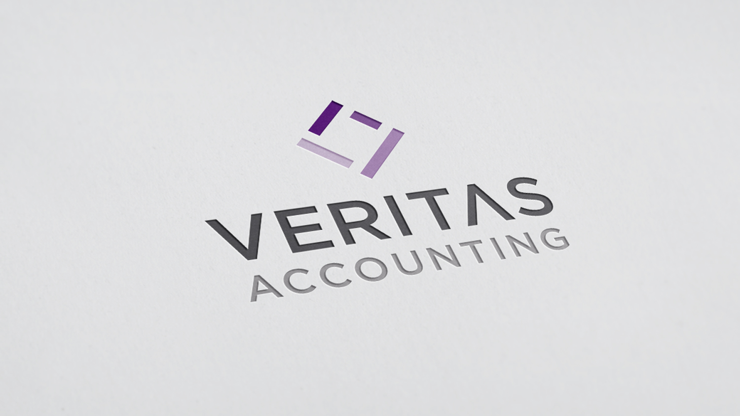
 The finished logo for Veritas Accounting
Veritas Accounting branding
Veritas Accounting, a newly established accounting firm in the Sacramento area, wanted a look and feel that set them apart from the standard garb of similar companies. As such, they wanted materials that were eye-catching, modern, but not without feelings of experience and security.
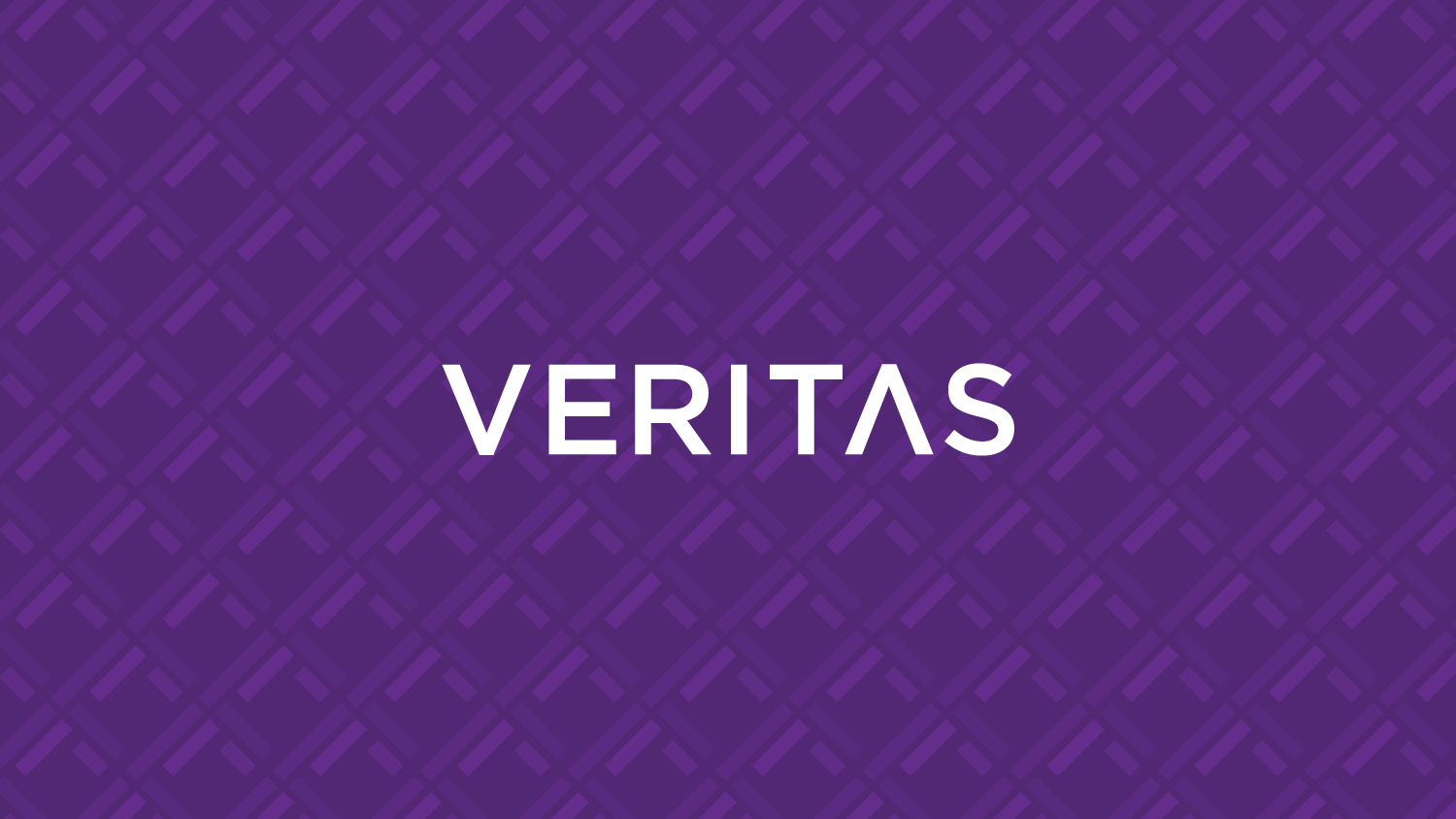
I developed a mark made up of four lines in varying length that join to form a cohesive diamond shape. This represents the reliable, multi-faceted service of the company. Additionally, symbolism of cooperation and stability is further emphasized with an ability for the logo to be used as a pattern. The dependable palette and devices transfer over to an informative website, paired with imagery that helps enforce their goals and values without coming across as boring.
 The logo allows for a tiling pattern to further incorporate the mark into other scenarios as a graphical element
 The site is fully responsive
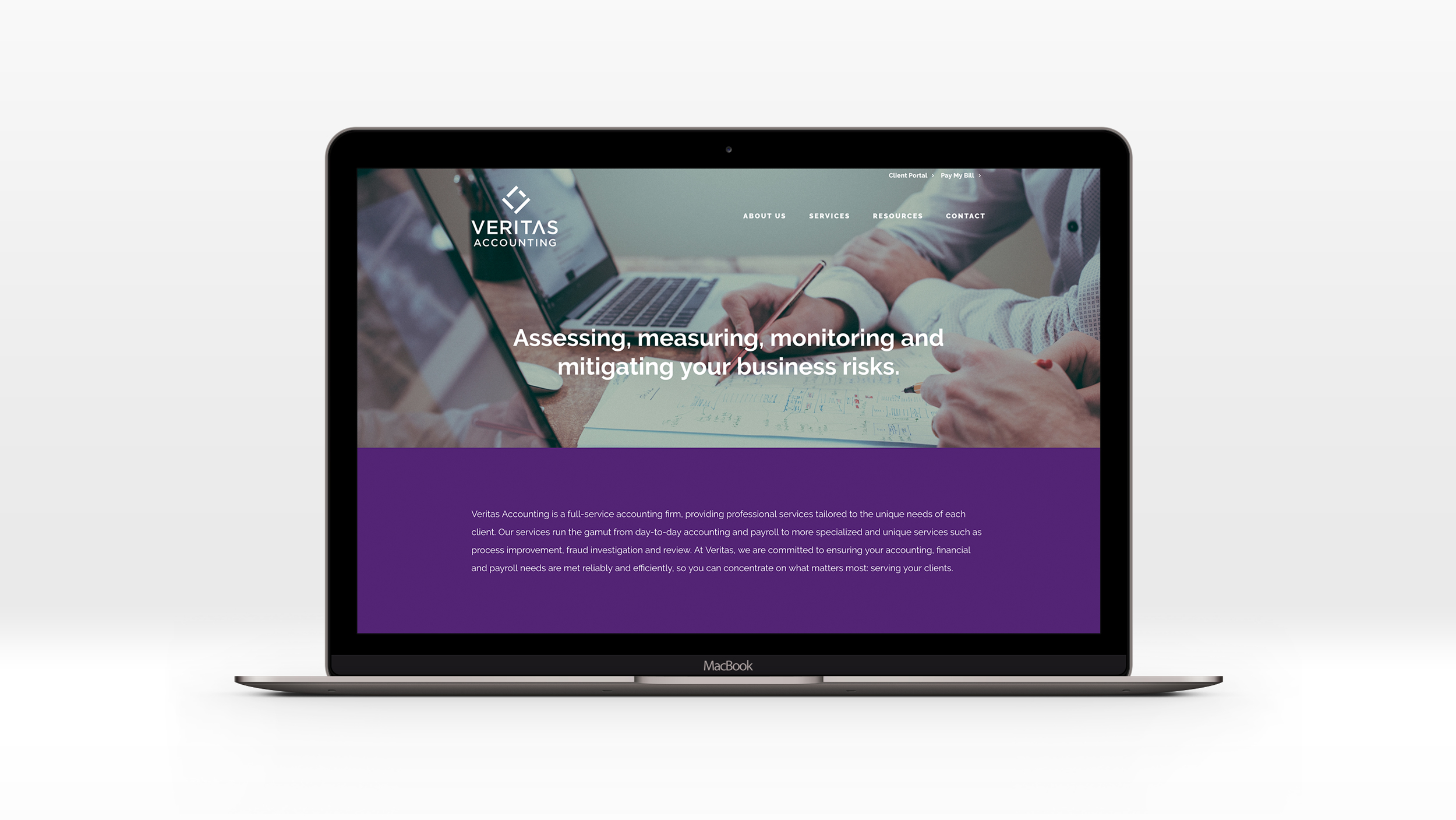
The branding was implemented on a website I designed and developed. The graphic stylings and colors are accompanied by relevant and vibrant imagery to further provide insight into the Vertias’s work and aid in public perception.
 The finished website
Back to recent work