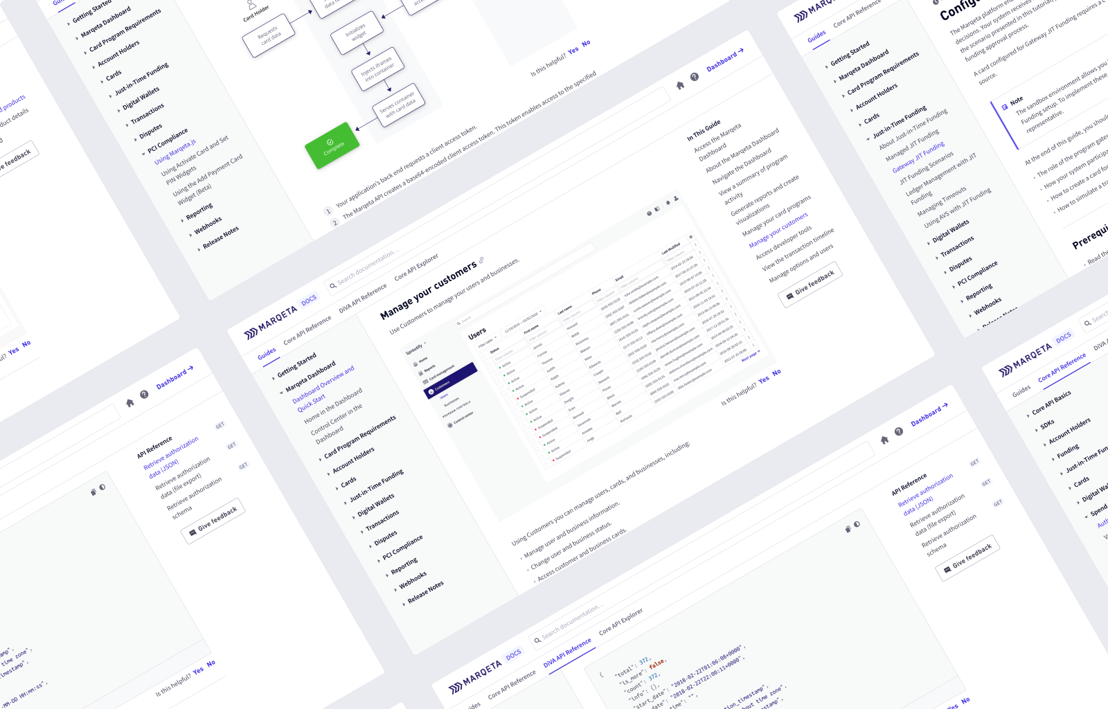
 A showcase of Marqeta docs.
Marqeta docs
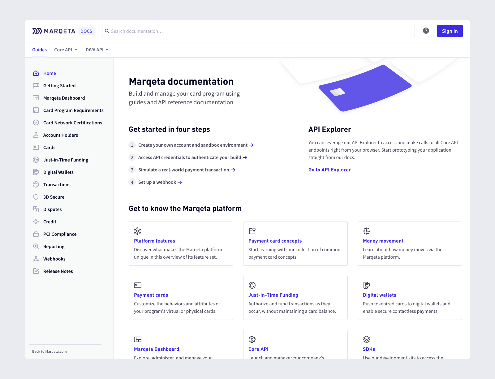
Marqeta offers a flexible API that innovative businesses can use to issue payment cards. With a robust API comes the need for easy to consume documentation. For this project, my team and I redesigned the Marqeta documentation site – prioritizing consumption of knowledge for developers. The interface was designed to support Marqeta's rapidly scaling product.
 The site's design is minimal with an emphasis on clean typography and whitespace to frame content.
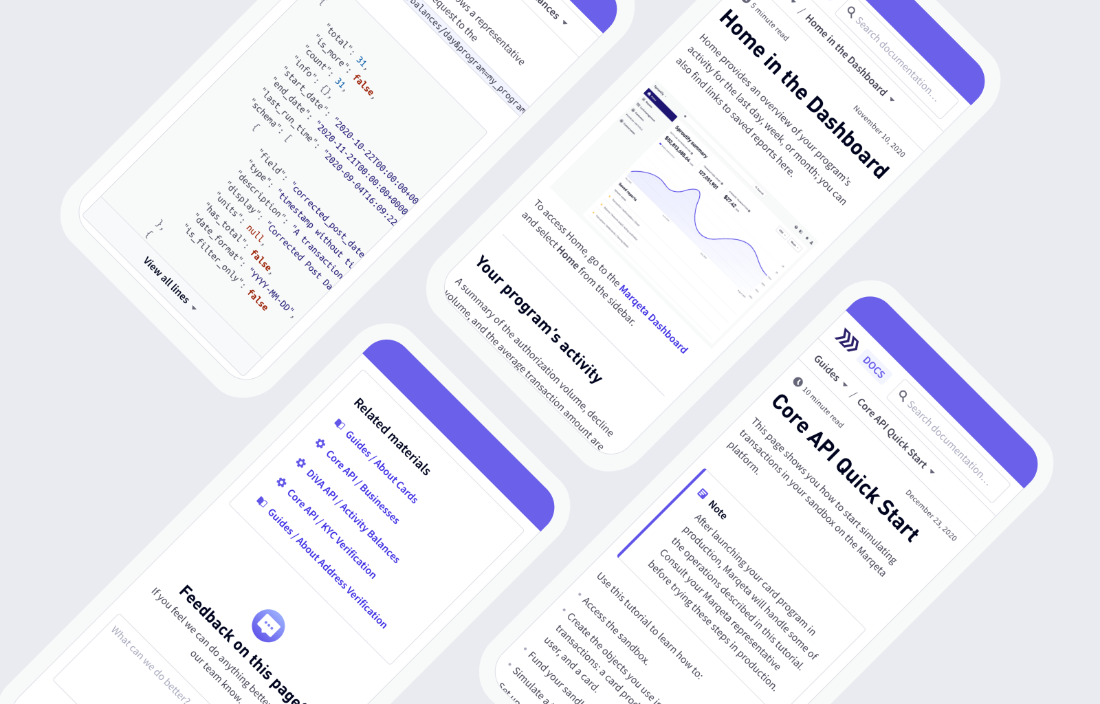
 We priortized supporting a mobile experience so that material can be accessed wherever our developers need it.
Widgets are embeded within documentation so that developers can explore the API without reaching for other tooling.
To ensure users can let us know how to improve, code blocks and images are paired with lightweight feedback modules.
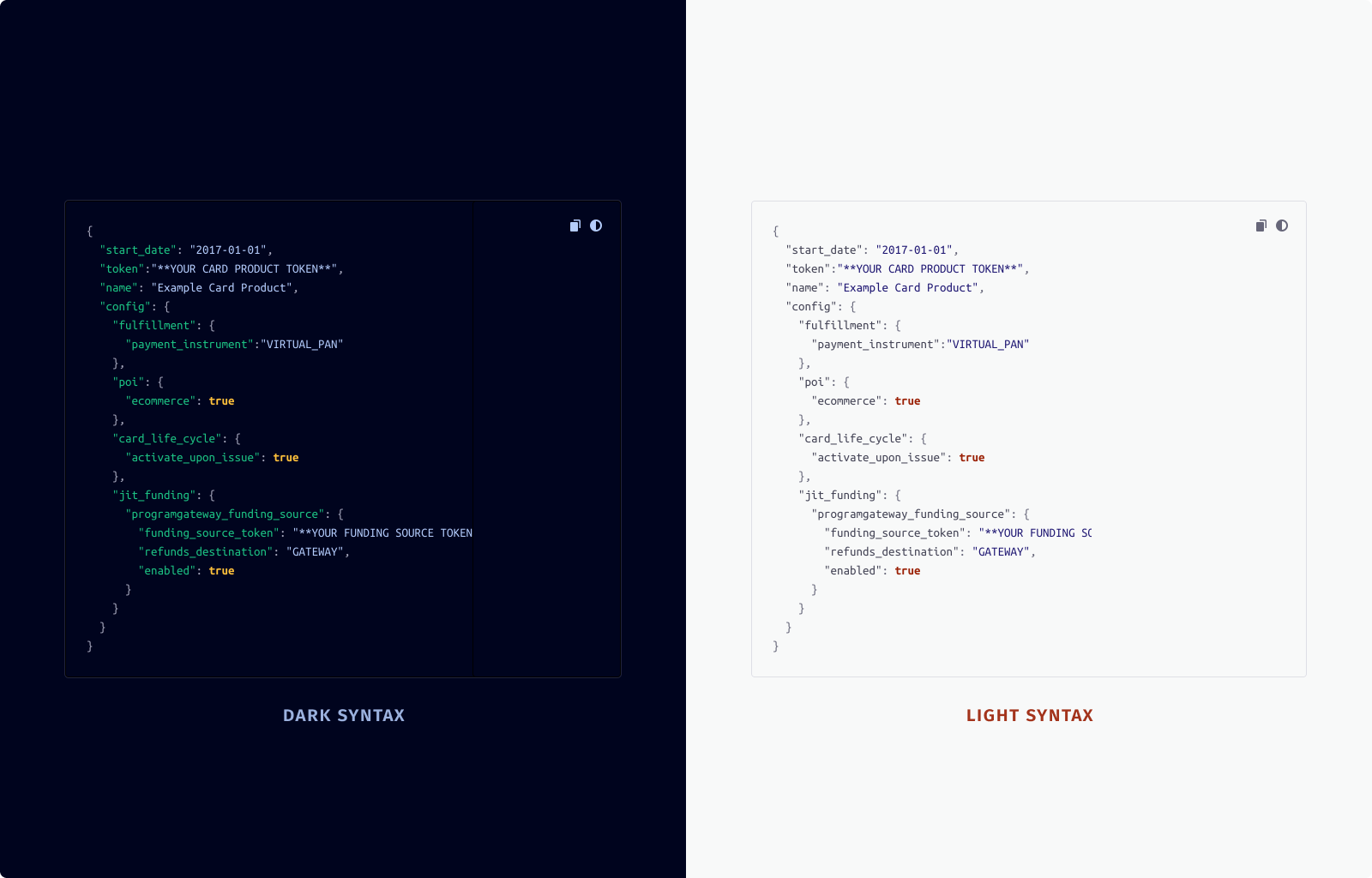
 Users can choose between light and dark mode code blocks.
Back to recent work